In a world overflowing with information, the real challenge isn’t finding data — it’s making sense of it. Whether you’re a marketer showing campaign results, a student presenting research, or a business leader guiding decisions, how you visualize data can make or break your message. The truth is, numbers alone rarely move people. But when they’re turned into visuals — clean, meaningful, and emotionally engaging — they tell stories that people actually remember.
Why Visuals Speak Louder Than Numbers
Think about the last time you saw a chart that instantly made a complex topic feel clear. Maybe it was a line graph showing global temperature change or a bar chart comparing company growth over the years. That “aha” moment doesn’t happen by accident — it’s the power of data visualization. Humans process visuals 60,000 times faster than text, which means when information is displayed visually, it sticks.
That’s why so many professionals today are learning how to create graphs that don’t just look good but communicate effectively. A well-designed graph does more than show data — it builds understanding. It connects the dots between facts and insights.
The Storytelling Side of Data
Great data visualization is like great storytelling. It’s not about showing everything — it’s about showing what matters most. Think of your data as a story with a beginning (context), middle (insight), and end (conclusion).
Let’s say you’re analyzing website traffic. A cluttered chart with every metric possible will only confuse your audience. But a clean line graph highlighting user growth over time, paired with key annotations, immediately communicates success. The goal isn’t to decorate your report — it’s to make sure people get it without having to think too hard.
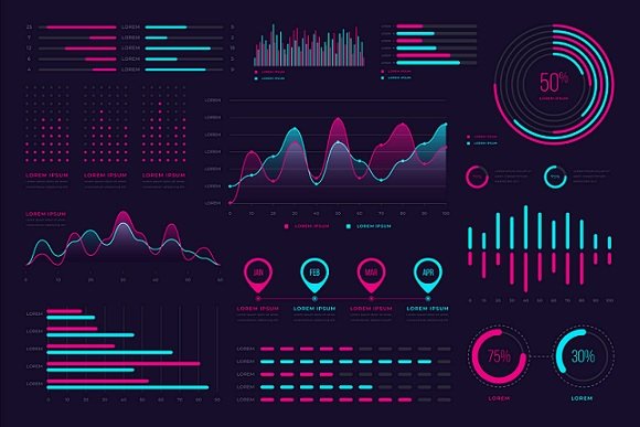
Choosing the Right Type of Graph
Not all graphs are created equal. Picking the wrong one can completely distort your message. Here are some practical examples:
- Bar graphs: Perfect for comparing categories — for instance, monthly sales or survey results.
- Line graphs: Ideal for showing trends or changes over time, like user growth or temperature variations.
- Pie charts: Great for showing proportions or parts of a whole, but best used sparingly.
- Scatter plots: Useful for identifying correlations, such as between social media activity and engagement rates.
Each graph type serves a unique purpose. The trick is to match your message to the right format — not the other way around.
The Power of Simplicity
When it comes to design, less is almost always more. The most effective graphs are often the simplest. Avoid clutter, unnecessary colors, and decorative elements that distract from your message. Use clear labels, readable fonts, and consistent color schemes.
A professional tip: limit your color palette to two or three complementary tones. Use one accent color to highlight the key data point you want viewers to focus on. This helps guide their eyes naturally without overwhelming them.
How Design Choices Affect Perception
Data visualization isn’t just about accuracy — it’s also about psychology. Small design decisions can dramatically affect how people interpret data. For instance, a graph starting its Y-axis at a high number can make differences look smaller than they actually are. Similarly, inconsistent scaling between charts can distort comparisons.
If you’re presenting to a team or clients, always make sure your graphs are both honest and intuitive. Visual integrity builds trust, and trust builds influence.
Real-Life Examples That Work
Consider how companies like Spotify or Netflix use data visualization. Spotify Wrapped, for example, turns raw listening habits into bright, dynamic stories. Netflix often visualizes viewer trends to guide recommendations and marketing strategies. These visuals aren’t just aesthetic — they make data personal and engaging.
In academic settings, clear graphs can elevate your research. Imagine submitting a project where your findings are illustrated with crisp visuals rather than raw tables — instantly, your work looks more professional and digestible.
Tips for Creating Impactful Graphs
- Start with a question – What story does your data need to tell?
- Keep it clean – Avoid clutter and unnecessary effects.
- Use hierarchy – Highlight the most important data visually.
- Tell a story – Guide viewers from setup to insight to takeaway.
- Test your visuals – Show them to someone unfamiliar with the topic. If they understand it quickly, you’ve succeeded.
The Future of Data Communication
As AI and automation continue to shape industries, data storytelling will only grow more important. Tools that make visualization easier — from business dashboards to creative apps — are democratizing data communication. This means anyone, not just data analysts, can transform raw numbers into meaningful visuals that inspire action.
Conclusion
At the heart of every powerful decision lies understanding — and understanding often begins with a well-crafted visual. Data itself might be objective, but how it’s presented is an art. Whether you’re preparing a school report, a business presentation, or a marketing pitch, take the time to shape your data into something people can see and feel. Because when numbers tell stories, people listen.